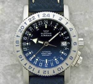
“For years I wore a Swiss Army watch with clear, readable sans-serif numbers on the face and not much else, so using the Utility face on the Apple Watch feels a bit like coming home,” Jason Snell writes for Six Colors. “It’s an analog watch face with room for a few complications and a dash of color — but only a dash.”
“I appreciate Utility’s small bursts of highlight color and the flexibility of its complications. I love the analog watch style of the day and date complication inside the circle,” Snell writes. “On the face I use every day, I have most of the complications turned off. Utility works for me as a more minimal face, but it also works as an information-dense one. It’s adaptable and beautiful. What I’m saying is, Utility has quickly settled in to be my favorite Apple Watch face. It’s a winner.”
Read more in the full article here.
MacDailyNews Take: Likewise, our Apple Watches all sport the Utility face, with a blue highlight, and battery (upper left), temperature (upper right), day/date (mid-right), and activity (bottom). As these were the first we set, weeks ago, we’ll likely change these complications over time as we’ve found that battery life isn’t as an important factor as we initially anticipated (we can check it very quickly in Glances anyway).
What’s your favorite Apple Watch face and how is it set up?

I used the Simple watch face with the battery in there left, temp in the upper right, next appt in the lower left and day/date in the lower right Monday through Friday and Mickey on the weekends.
They haven’t made my favorite watch face yet.
✔️ the android store, I’m sure that’s where you will find yours.
Nope, it’s not there either, although this comes close – https://play.google.com/store/apps/details?id=pl.nwg.dev.wear.twentyfour&hl=en
What I want is something like this-
Mickey would be nice for a while. Then after tiring of that something more practical reflecting my age.
Simple face. No detail at all. Temp lower right. Date in the face. Very uh.. simple and elegant looking.
I have nice analog watches that I probably will wear on my other wrist; so I wouldn’t want to display analog time on my Apple Watch.
Simple here: no dial and only handeks . Four corners.. International time, stop watch, activity, battery .
Very elegant imho .
Love this thing !
Ohh and date 🙂
Actually I like the modular design the best, only because it has the most complications and easy to read quick.
I use the MODULAR face –
Day/Date (upper left) TIME (upper right)
Calendar (middle)
Battery (lower left) Weather (middle) Activity (right)
I agree with MDN’s take – battery life has not been an issue since Day 2, need to find something else to put in lower left on mine.
Settled on this layout instead …
Activity (upper left) TIME
Calendar (middle)
Day/Date (lower left) Weather (middle) Sunrise/Sunset (right)
Modular is by far the most usable. The calendar is brilliant in the middle.
Time -upper right
Date- upper left
Calendar- middle
Temp – lower left
Battery – lower middle
Time in Mumbai – lower right (work with a remote dev team in India)
Hands down the most usable watch face by far. However, when dressed up and heading out on a date, then use Simple with no detail or other indicators.
I use Utility face as well, but with the details rolled all the way down to minimum. It’s the most minimalistic face that does not lose functionality. I have battery in upper-right, activity in upper-left, weather along the bottom (as this has the greatest benefit for added detail), and the date in the center. Highlighted in green, it’s perfect and the one I’ve settled on happily after many revisions and trials with other faces.
I prefer Modular, although Utility is a close second. I like the extra data spaces in Modular.
The battery complication isn’t really useful for me. I’ve never been able to run the battery out in a day, and it charges on my nightstand, so after the first couple of weeks, it just reinforced the notion that I could usually go 2 days on a charge, but will always be able to make it at least 1 day.
I use modular during the work week:
• Calendar is prominent
• Date
• Temp
• Moon Phase
• Activity
Weekends: I switch between Astronomy & Solar (cause I don’t wan’t need so much info).
*want/need
Simple: temp – upper left
Sunset/Sunrise – upper right
Date – middle
Battery – lower left
Activity – lower right
Only analog face that allows for 5 custom complications. Modular digital face also allows for 5 custom complications. All the rest allow fewer including Utility – only 4.👀😱😨😖😜🚀
I was going to build a morphing Salvador Dali type watch face APP but Apple won’t let us change the faces yet.
Yeah I had a watch face design of my own a few years ago that I drafted out in Photoshop. Hopefully this becomes an option because I was hoping to someday bring it to life.
For normal conditions:
UTILITY
Minimum details
Day of week/date upper left
Temp upper right
Calendar bottom
For a more formal occasion:
SIMPLE
Minimum details (hands only)
Date middle right
In both cases, I tend to modify the second-hand color to match clothing colors.
I use color right now, but it’s disappointing. I REALLY want to be able to design (or purchase) my own watch faces. None of the current ones do the trick because none are based on a square look. There are a TON of brilliantly beautiful analogue watches developed over the years with a square look. I will be more than happy to pay homage to one or more of them as soon as Apple deigns to release a watch face kit….. Can’t come soon enough because the current batch lacks any real inspiration. 🙁