An iOS 7 redesign posted on Dribbble.com, and online community for designers, was “created by 20-year old UI/UX designer Leo Drapeau [and] has, as of today, reached over 97,000 views,” Sarah Perez reports for TechCrunch.
“Drapeau, who’s currently living in Paris and is pursuing his Bachelor’s in Web Design at a school called EEMI, says he made his version of the redesign in a few hours,” Perez reports. “‘I was following the WWDC keynote, and I was really excited about the overall UX and UI changes and evolutions in iOS 7, but the icons of the homescreen bugged me,’ he explains. ‘So, I just wanted to refined them a little, to make them cleaner and more harmonized, but not to reinvent the whole design.'”
Perez reports, “The student designer’s work has clearly struck a chord. The set of iOS 7 images now has ten pages and hundreds of comments, most of them positive and some offering tips as to how the design could be improved a bit further with minor tweaks.”
MacDailyNews Take: Yeah, um, Jony et al., you lose (on consistent light source, certain sizing, and the settings icon, among others). If you haven’t already, send Leo an offer letter now.
Of course, once you organize your stuff into folders and change your wallpaper, iOS 7 looks markedly different than what you see on Apple’s site. Something more like this: Apple’s basic iOS 7 example (left) vs. a MacDailyNews iPhone 5 running iOS 7 with apps in folders (right).
So sorry, Leo ‘Samsung’ Drapeau has clearly invented a completely different layout to that released by Apple and they are therefore ‘unavailable’ for Apple to copy.
I just read Leo’s post. What an arrogant little dude. He says “So, I kept the same design direction…” Kept the same design direction? You copied the entire thing and made some minor tweaks. Grow up and create something of your own.
Careful now Jensen, Ives had access to all the raw vectors and made tweaks to many app icons too, disregarding the shadows, highlights, textures – Ives then created some strange Flowery Free Feelie abstract icons too. Ives even got carried away with detail on some like Newsstand.
Design is subjective, and there are a thousand nos… very few yeses, and so the design continues to refine even re-simplify until focus comes to a clear absolute… the perfect solution.
And Jensen, the thought on iOS is FEEL, the abstract icon apps provide emotional responses, though none of the other apps do, why is there this inconsistency – why do we see such obvious errors from our beloved Ives? Don’t settle for mediocre. Don’t be a lemming. Apple is not perfect. This after all is a new beginning for Apple.. open-source designing – lol.
This one comes from graphic design student Lewis Jones, who says: “It’s never too early for a re-design, right? I tried to keep that bright colour scheme and flat design they were going for but looking a bit nicer (in my opinion).”
Careful? I really don’t get you guys. The Apple icons are the result of years of design evolution and refinement. And they’re not finished. Some kids spend “a few hours” tweaking them and then take credit for superior design? Classic Salieri narcissism. Lewis Jones’s work is total amateur. Leo’s is ok but it’s just minor tweaks so he can say he redesigned them. Effing ridiculous!
By the, speaking of being “careful,” Donald… By “Ives” do you, by any chance, mean Jony Ive?
no you are a lemming…
This redesign comes from Christophe Tauziet, a product designer at Facebook. “I like iOS 7. I really do,” Tauziet writes. “But I can’t stand for these homescreen icons. So I wanted to see what I could do in an hour.”
I believe Ives needed to further refine his work.
And you really show that there can be improvements still.
Well done, happy you have…
– consistent centred spacing and x heights per icon inside the button square (after all) iOs7 was to become more unified and flat – so do it Ives.
– further simplification on detailed icon apps,
like settings (though this looks more android now), stocks is simplified, tiny lines in camera, extra lines in mail removed, too many tiny lines in safari made better, completely new reminder icon cheers, passbook hurray the miniature icons are gone, and Compass.
Love to see Game Centre, Newstand, and Photos fixed. And the two colour splotches less abstract. However, Appel wants us to FEEL the apps, the buttons to be more emotional, so why aren’t all the icons abstract?
Definitively, Leo’s looks less crowded, not just because they are smaller, but also more spaced. In fact, I couldn’t believe Jony would approve that crowded look. So I went to Apple’s website, and yes, icons are more spaced there… yes guys, it’s possible you are looking to a doctored version just to make it look uglier than the other. Unfortunately, while I’ve made a picture of this, I don’t know how to post it in this comment, could anybody help me on this?
Upload to Flickr and just post the link to the photo page.
THE CALENDAR number is WAaaayn oo thin. Totally sucks!!!
What a step backwards. I want to see the date BIG & BOLD at a glance. The settings icon looks like a fan. The kid wins on that one and on the reminders too! Steve Jobs must have been nixing lots of Jony’s iterations. The calendar & settings betas would have never passed SJ’s design eye. As a lifetime Mac user & Graphics Pre-Press coordinator, I appreciate Ive’s contributions until now. Yes,, APPLE HIRE LEO TO HELP JONY.
Hermit, I think you might have them reversed and you have a preconception that you want to like the kid’s better. The calendar numbers on the kid’s version are even thinner (less bold) than Ive’s, and the kid’s settings icon looks like a fan; Ive’s looks like gears (gears => machinery => settings, right?).
Jensen, the button of the app uses a loose circular grid system made by Ives, that circular grid system is not followed in several cases by Ives himself. Now that does reflect to what you mention, type would be too thin, hence why does a clock need every hour displayed. Why does it use the system font? Where Ives cheats and maximizes beyond his grid system, he also sets new territory where the square becomes the ultimate grid and size. To get yet a different yet abstract touchy feel app icon, apps like clock could represent a clock that has a square face or zoom in and crop a corner still with the hands of time presented by pointing a the 4,56th hour. Weather could be filling up the square, and cropped more interestingly too. This is considered tight. A tight cropping causing interest intrigue and abstract feeling.
Ives said he dislikes things to represent textures, why then represent a gear of a clock…
no i disagree, gears ≠ machines ≠ settings because computers and electronics are not mechanical
Leo (the kid) spaces the inner graphics well inside the button, he removes unnecessary lines, Leo has done well, yet he can still go further.
Again… Do you guys realize that Ive’s design on the LEFT and Leo’s is on the RIGHT? Because all of Ive’s circles are the same, consistent size, while Leo uses at least three different circle sizes which is distracting and an immediate FAIL.
If you had it backwards you can admit that now and end this ridiculousness.
I didn’t say “gears = machines = settings,” I said “gears => machinery => settings.” “=>” means implies.
Mostly just get a life! They’re just redesigned icons on your phone which will last a few years and get redesigned again. If you are so interested, why don’t you send your portfolio to Ive and apply for a job?
And it’s Ive not Ives.
good point, “weather” and “calendar” app buttons were the ORIGINAL live title… live app icons, updating to the weather status temperature and yes the real date.
So yes, good point, expect to read those better.
was the “Clock” too always representing real time?
I completely missed that.
So you’re a Mac user and you can co-ordinate pre-press. Woop-de-do, that makes you a designer by default? Speaking as someone who was doing design, pre-press, book layout, typography, camera work, darkroom work, plate-making, just about everything bar actual typesetting and running a Heidelberg, from forty years ago, and Mac work for pre-press including scanning photos on a Crosfield 6250 drum scanner fifteen years ago, I think I actually have a clue, and there’s nothing wrong with any of these icons. SJ frequently either got things wrong, or changed his mind on a whim, so to say he would never have passed these is bollocks, you have no idea, no insight into what SJ might have thought, because you are not him!
Jonny Ive is a better industrial designer, with a better design aesthetic, than pretty much anyone in the industry, and I see nothing about what has been shown so far that offends my own design senses.
Perhaps you need to zoom in. The basic icon designs are certainly similar, but there are some design nuances that make Leo’s improvements the better option IMO. Leo’s interpretation is more simplified and has more depth. Ridding some of the icons of unnecessary detail makes them read better. Slight drop shadows give them a bit more depth and contrast against the background.
I also prefer Apple’s icons. Drapeau’s circles are too small leaving too much border. The clock isn’t even the same size and if you are a designer nitpicking consistency posting an improve copy you should at least be consistent. Shading sometimes has subliminal messaging. The weather icon Apple shade blue on the top. Isn’t the sky blue above. For the most part IMO Drapeau design’s are over simplified. Imagine the icons without the name and what the image conveys about the purpose. Would a user know what it does. Drapeau’s design of passbook tells me nothing without the name below. His reminders design looks more like a to do list. Reminders are usually associated with some chronological order and people write them in a list. I could go on and on.
For the record I don’t like the photos or Game Center icon.
Some of the iOS7 beta’s are better, but overall yes, Drapeau’s are better.
For one, some of the official icons are shaded lighter on top, others on bottom. Not consistent. All of Drapeau’s icons, where there is shading, it’s lighter on top.
Easier to try and improve little bits rather than create a new design from scratch isn’t it?
Techcrunch and others seem to be on a mission – probably sponsored by usual suspects like Samsung, Google, Microsoft… – to denigrate Ive’s entire reputation based on how some icons look on a first developer-only beta.
Jeez! What? Are you Johnny Ives mother? So the kid came up with an improvement on something designed by Sir Jonny! So what? Quit being so defensive about someone you don’t know. Stop it!
He’s in charge. It will have his name on it. He has final approval. But if you want to act like you don’t understand all of that, fine. And I’m not being defensive about media headlines. It’s just that there is seldom if ever an objective comment around here. People are afraid to speak honestly for fear of being attacked by fanboys. You know, the guys who say that Apple does everything perfectly every time. Fanboys.
Are you for real?
I wrote my honest opinion and YOU decided to reply to it and attack me over it.
Now you’re crying that people like you are afraid to speak honestly for fear of being attacked?
There you go, as I said he outsourced it to the web marketing team to set the initial look and palette. So much fuss over a beta release that will be changed in a matter of months.
Leo makeover wins hands down… Sorry Johnny & team.
Give the popularity and attention these icons are getting, it certainly would make sense for Apple to take notice. Perhaps a job or a licensing deal for Leo?? The move would not only improve iOS7’s UI, but it would be great PR. A great story that would focus media attention on Apple and iOS7.
Jony understands that the majority of people with iPhones are 35 and above (as they earn more money). Many young people have them courtesy of their parents. As out eyes get weaker with age, the icon within the button should be larger NOT smaller. Ives probably knows this because, well…he is brilliant.
Leo…’Honey I’ve shrunk the icons’….is not worth the attention it is getting.
Apple’s version is better. Bigger images. The corners of the buttons are rounder. The Compass icon is a compass. Leo’s is a non-descript dial. What is Leo’s Passbook icon? A set of folders?
I like some of the revised icons, but it seems like this will not matter a lot since how many of Apple’s default apps do you have on your first page? My first page is dominated by 3rd party apps, and unless they all get together and agree upon a style and consistent lighting source, it’s going to look “inconsistent” anyway.
1) Forcing the same colors for typography and icon backgrounds. The result is nice looking text, but garish over saturated icon backgrounds.
2) The much ballyhooed icon layout rulings are wrong. The outer layout circle should be bounded by a square formed from the centers of the corner radii, as Leo has done. Ive’s ruling uses the tangent midpoints of the corner radii for the bounding rectangle. This makes the large circle in the ruling too large. The result is over-stuffed icons with emaciated borders.
Leo’s is just a polished turd, the original is the turd. Ill be glad when this flat fad is over. Some flat looks good, nothing Ive seen from iOS7 so far is is good though. For flat design to look good it must have the right colour combinations. Everything Ive seen from iOS 7 just looks like a rough mock job of a new OS, not the 7th generation of the OS formerly known as the best looking OS available
I think Leo has a great future however there is really nothing original in his concept. Sir Jony has a proven track record and I’d bet on him. Photos looks like the NBC peacock in 360 degrees.
With all due respect, I don’t think Leo was trying to totally rethink the iconography, he was simply trying to fix it.
He was simply tweaking the colors, gradients, and proportions. It also looks like he took the icon size back to the old iOS size of 114 points. iOS 7 enlarges the icons to 120 points which I think is too crowded.
My take is that he succeeded splendidly and fixed some really terrible looking work by Apple.
I like Ive’s icons much better. They put the emphasis on the concept being conveyed by giving maximum real-estate to the image. The fact that they are “buttons” is secondary so there is no benefit in having more blank space around the images by making them smaller. Ive is a man of concept and he clearly understands that purpose of his work overrides the mechanisms used to implement it (i.e. bigger pictures conveying concept trump button background eye candy)
On a less “conceptual” angle, for people with “older” eyesight, such as myself, bigger is always better.
I strongly disagree. Ive’s icons are overstuffed and out of proportion.
The best of the new Apple icons (not shown above) is the new WWDC app icon. It’s flat, but with a rich purple background and a very subtle color gradient. Plus, the Apple logo is properly sized. The first rule of graphic design is leave enough white space, or in this case, purple space.
Even Microsoft spent more time copying the MacOS that that, anyone can take an existing design and tweak it a bit. Overall its about even some better on original some on the copy. Reducing the size of the etc is a negative move with less clarity, making the grad consistent top to bottom is positive, the speech bubble is better as is the settings icon but reminders, game centre, passbook, newstand less clear and defined especially on a small screen.
On both the safari icon is dreadful.
Have to see the whole thing for real to judge the success of the redesign generally Im hopping that the 3 dimensional aspects will be a move forward and a reason for flattening the logos but for me logos with some depth and shadow are generally better than flat simple colours which tends to look basic rather than classy not something that Apple will want so the other ‘live’ aspect have a lot to make up for for me to make it zing.
Dear MDN, Design is not how it looks, it is how it works. The student had only one job to do: redesign the icons. Apple team had to make other changes to the OS. Making the icons nice was not on the priority for WWDC demo, that doesn’t mean it won’t be polished.
I liked Apple’s better. Beyond that, this new color scheme gives me the creepy-jeebies for being too derivative of Windows 8 and their “flat” icons. Can tiles be far behind?
Has anyone noticed that the caption mislabels the screenshots? The French version is on the Left, which is the student’s and Apple’s on the Right. Look at the calendar icon – is Apple putting out screenshots in French?
Unless the beta I’m running somehow got the french student’s mockup, the caption is correct: iOS 7 beta is on the left. In particular, the Settings app is correct, the Notes app has lines going clear across the icon, and the Compass app has NEWS indicators.
I predict we will soon see another graphic almost identical to this with IOS7 on the left and the next Samsung Galaxy phone on the right. What do you think? 6 months? Less?
Wow… Macdailynews admitting that something Jony designed might not be all that great… Who posted this? I demand to know what you did with the Macdailynews staff!
The simplifying of icons into meaningless blobs has to stop. Leo offers only another step toward flat blankness, which is NOT good design. Good design offers intuitive functionality. Hard to see how bubbles represents games, or a color selector represents photos, or three bars of color represents a passport.
This week has now presented me with two reasons to ignore TechCrunch.
1) They mistook USB 3 ports for Firewire 800 ports on the upcoming Mac Pro cylinder.
2) This stupid article.
3) The childish comments on their website.
No make that three reasons to ignore TechCrunch. Oh, but then again, we have childish comments here as well.
1. Ive likely didn’t design these. It’s common knowledge (at least I thought it was) that Ive gave the palette to the marketing and communications department. I’m not saying he wasn’t involved, but he wasn’t drafting them himself.
2. Ive had a total of 8 months to totally redesign the look and feel of iOS. That’s not a lot of time. *Maybe* home screen icons took a back seat, given that they’re probably the easiest part of the experience to get right.
3. iOS 7 won’t be released until the fall. Apple still has at least 4 months to tweak the icons. This is a first shot.
LOL@MDN endorsing some designer tweaking the icons in the first iOS developer preview. The home screen icons are about 1% of the total iOS experience. Excuse me if I neither give a shit what some random design student thinks is appropriate nor believe that this will be the final look and feel of the icons. I have more faith in Jonny Ive and his decades of superior design work than I do in someone who probably produces Apple concept videos in their spare time.
Honestly, these are some pretty small differences. I like some better on each side but the differences are negligible. What I think would be a lot more useful would be live icons that display data, clock and weather in particular. Luckily I’m now seeing rumors that this may actually be the case at least with the weather.
I find Ive’s version better and more consistent. I could find some little tweaks to make it better but overall it is great. For those who don’t understand why the weather icon has a reversed gradient there is a very specific and correct reason why it is so. When you look at the sky it is darker higher up and lighter as it gets closer to the ground. This icon was designed intentionally to mimic nature and if done the opposite way it just looks odd.
Just so you know, MDN, your screenshot of iOS 7 is a violation of your Developer NDA agreement, and should be taken down immediately. Apple rarely enforces the NDA, but as big, vocal Apple fans, you should know better.
Dude – the iOS 7 homescreen is slathered all over Apple’s website, and is currently the first thing you see when going to apple.com.
You can critique MDN for their design eye – or for being so foolish as to compare any alternative icon design to the first iteration of a developer preview – but they’re not in violation of NDA.
What ever happened to Apple leading in iconography… the eighties… the look of simplicity… the artistry… the calligraphy… the 100,000s+++ of dollars spent on logo design… where is all that?
Where is THAT Apple? Rushing a bunch of ham fisted logos out to market? If you didn’t get it right before— then say so and GET IT RIGHT NOW!
I like Johnny’s better, except the one with the check box, he did win that one. The others he mostly just made the center art smaller. I think they need to be large.
Nah I don’t agree.
They look a little but sharper because they are smaller and some areas and stuff but that’s a taste thing I think. After looking for a few minutes I can’t say I think his is better. Maybe 2-3 if the icons looks sharper but change one and you probably have to change everyone.
I own an apple product and I don’t care about the icons, I think people should complain that they new icons don’t аdd ANY functionality to them so who cares what they LOOK like, give me widgets!
Actually, with iOS’s design, I find that I have to think and get to the app. With Leo’s design, I do not have to think before I know which app is which. And for the case of icon and UI design, no thinking needed is better than logical thinking needed. Also, the App Store icon from Leo clearly shows what it means by “Less is More”.
To me iOS7 is a total FAIL. The graphics are an abomination and any good graphics design school would give you a big F. I found the cheap tacky graphics so disgusting that I reloaded iOS6. Of course I could not restore any of my apps or contacts, but I would rather go through the trouble to get good looking graphics. Sure iOS7 has some new features, but there is not enough of a difference for me to put up with 1980s IBM-PC CGA graphics on my high resolution retina display. Does anybody really like the flat boring washed out graphics? Why would anybody like flat cheap look compared to iOS6. I hope this flat low tech style of graphics is not the “in” thing. It is a step back in time to when having a 16 color monitor was a bit deal.
Thanks for the back-up Chriskooo. Most of these other commenters don’t understand the design process. Ives’ goal is not to reinvent the past but set the tone for future design from Apple. iOS7 was more about abandoning drop shadows and glares and RGB colors than it was about perfecting the calendar icon, etc.


Well done Leo. Are you reading ?
So sorry, Leo ‘Samsung’ Drapeau has clearly invented a completely different layout to that released by Apple and they are therefore ‘unavailable’ for Apple to copy.
This whole thing is insanely stupid. So some design student copied Apple’s icons and edited them a bit who give a crap? I mean, really. Wow.
Oops. Typos in my post. Maybe a journalism student can add the necessary characters and become the hero of my post.
I just read Leo’s post. What an arrogant little dude. He says “So, I kept the same design direction…” Kept the same design direction? You copied the entire thing and made some minor tweaks. Grow up and create something of your own.
Careful now Jensen, Ives had access to all the raw vectors and made tweaks to many app icons too, disregarding the shadows, highlights, textures – Ives then created some strange Flowery Free Feelie abstract icons too. Ives even got carried away with detail on some like Newsstand.
Design is subjective, and there are a thousand nos… very few yeses, and so the design continues to refine even re-simplify until focus comes to a clear absolute… the perfect solution.
And Jensen, the thought on iOS is FEEL, the abstract icon apps provide emotional responses, though none of the other apps do, why is there this inconsistency – why do we see such obvious errors from our beloved Ives? Don’t settle for mediocre. Don’t be a lemming. Apple is not perfect. This after all is a new beginning for Apple.. open-source designing – lol.
This one comes from graphic design student Lewis Jones, who says: “It’s never too early for a re-design, right? I tried to keep that bright colour scheme and flat design they were going for but looking a bit nicer (in my opinion).”
Careful? I really don’t get you guys. The Apple icons are the result of years of design evolution and refinement. And they’re not finished. Some kids spend “a few hours” tweaking them and then take credit for superior design? Classic Salieri narcissism. Lewis Jones’s work is total amateur. Leo’s is ok but it’s just minor tweaks so he can say he redesigned them. Effing ridiculous!
By the, speaking of being “careful,” Donald… By “Ives” do you, by any chance, mean Jony Ive?
no you are a lemming…
This redesign comes from Christophe Tauziet, a product designer at Facebook. “I like iOS 7. I really do,” Tauziet writes. “But I can’t stand for these homescreen icons. So I wanted to see what I could do in an hour.”
In an hour Jony…
Well he fixed the minor errors didn’t he?
Making light source constant etc
Without looking to see which was which, I preferred the original. And the original has been manipulated to make it look less palatable.
Well done Leo,
I believe Ives needed to further refine his work.
And you really show that there can be improvements still.
Well done, happy you have…
– consistent centred spacing and x heights per icon inside the button square (after all) iOs7 was to become more unified and flat – so do it Ives.
– further simplification on detailed icon apps,
like settings (though this looks more android now), stocks is simplified, tiny lines in camera, extra lines in mail removed, too many tiny lines in safari made better, completely new reminder icon cheers, passbook hurray the miniature icons are gone, and Compass.
Love to see Game Centre, Newstand, and Photos fixed. And the two colour splotches less abstract. However, Appel wants us to FEEL the apps, the buttons to be more emotional, so why aren’t all the icons abstract?
Your hired.
http://www.cultofmac.com/231264/designers-set-about-fixing-the-mess-apple-made-in-ios-7-gallery/
you’re hired 🙂
All I see is a cheaply sheepish copy. Where is the difference? Am I missing something LOL? Between the two I still prefer Jony’s design over Leo’s.
leo’s the pictures/letters/numbers are a bit smaller and thinner with less effects
they aren’t better, just personal preference
The smaller is NOT a good thing.
Definitively, Leo’s looks less crowded, not just because they are smaller, but also more spaced. In fact, I couldn’t believe Jony would approve that crowded look. So I went to Apple’s website, and yes, icons are more spaced there… yes guys, it’s possible you are looking to a doctored version just to make it look uglier than the other. Unfortunately, while I’ve made a picture of this, I don’t know how to post it in this comment, could anybody help me on this?
Upload to Flickr and just post the link to the photo page.
THE CALENDAR number is WAaaayn oo thin. Totally sucks!!!
What a step backwards. I want to see the date BIG & BOLD at a glance. The settings icon looks like a fan. The kid wins on that one and on the reminders too! Steve Jobs must have been nixing lots of Jony’s iterations. The calendar & settings betas would have never passed SJ’s design eye. As a lifetime Mac user & Graphics Pre-Press coordinator, I appreciate Ive’s contributions until now. Yes,, APPLE HIRE LEO TO HELP JONY.
Hermit, I think you might have them reversed and you have a preconception that you want to like the kid’s better. The calendar numbers on the kid’s version are even thinner (less bold) than Ive’s, and the kid’s settings icon looks like a fan; Ive’s looks like gears (gears => machinery => settings, right?).
Jensen, the button of the app uses a loose circular grid system made by Ives, that circular grid system is not followed in several cases by Ives himself. Now that does reflect to what you mention, type would be too thin, hence why does a clock need every hour displayed. Why does it use the system font? Where Ives cheats and maximizes beyond his grid system, he also sets new territory where the square becomes the ultimate grid and size. To get yet a different yet abstract touchy feel app icon, apps like clock could represent a clock that has a square face or zoom in and crop a corner still with the hands of time presented by pointing a the 4,56th hour. Weather could be filling up the square, and cropped more interestingly too. This is considered tight. A tight cropping causing interest intrigue and abstract feeling.
Ives said he dislikes things to represent textures, why then represent a gear of a clock…
no i disagree, gears ≠ machines ≠ settings because computers and electronics are not mechanical
Leo (the kid) spaces the inner graphics well inside the button, he removes unnecessary lines, Leo has done well, yet he can still go further.
Again… Do you guys realize that Ive’s design on the LEFT and Leo’s is on the RIGHT? Because all of Ive’s circles are the same, consistent size, while Leo uses at least three different circle sizes which is distracting and an immediate FAIL.
If you had it backwards you can admit that now and end this ridiculousness.
I didn’t say “gears = machines = settings,” I said “gears => machinery => settings.” “=>” means implies.
Mostly just get a life! They’re just redesigned icons on your phone which will last a few years and get redesigned again. If you are so interested, why don’t you send your portfolio to Ive and apply for a job?
And it’s Ive not Ives.
good point, “weather” and “calendar” app buttons were the ORIGINAL live title… live app icons, updating to the weather status temperature and yes the real date.
So yes, good point, expect to read those better.
was the “Clock” too always representing real time?
I completely missed that.
So you’re a Mac user and you can co-ordinate pre-press. Woop-de-do, that makes you a designer by default? Speaking as someone who was doing design, pre-press, book layout, typography, camera work, darkroom work, plate-making, just about everything bar actual typesetting and running a Heidelberg, from forty years ago, and Mac work for pre-press including scanning photos on a Crosfield 6250 drum scanner fifteen years ago, I think I actually have a clue, and there’s nothing wrong with any of these icons. SJ frequently either got things wrong, or changed his mind on a whim, so to say he would never have passed these is bollocks, you have no idea, no insight into what SJ might have thought, because you are not him!
Jonny Ive is a better industrial designer, with a better design aesthetic, than pretty much anyone in the industry, and I see nothing about what has been shown so far that offends my own design senses.
Perhaps you need to zoom in. The basic icon designs are certainly similar, but there are some design nuances that make Leo’s improvements the better option IMO. Leo’s interpretation is more simplified and has more depth. Ridding some of the icons of unnecessary detail makes them read better. Slight drop shadows give them a bit more depth and contrast against the background.
I also prefer Apple’s icons. Drapeau’s circles are too small leaving too much border. The clock isn’t even the same size and if you are a designer nitpicking consistency posting an improve copy you should at least be consistent. Shading sometimes has subliminal messaging. The weather icon Apple shade blue on the top. Isn’t the sky blue above. For the most part IMO Drapeau design’s are over simplified. Imagine the icons without the name and what the image conveys about the purpose. Would a user know what it does. Drapeau’s design of passbook tells me nothing without the name below. His reminders design looks more like a to do list. Reminders are usually associated with some chronological order and people write them in a list. I could go on and on.
For the record I don’t like the photos or Game Center icon.
a future samsung employee from what I can tell…
Photo and Game Center icons… Hate them on both.
Some of the iOS7 beta’s are better, but overall yes, Drapeau’s are better.
For one, some of the official icons are shaded lighter on top, others on bottom. Not consistent. All of Drapeau’s icons, where there is shading, it’s lighter on top.
The Photos app icon sucks regardless.
That’s like asking “who’s better looking: Whoopi Goldberg or Roseanne Barr?” Neither one will win a beauty contest any time soon…
But I would much rather watch Whoopi act. I don’t care if I ever hear anything again from Roseanne.
Easier to try and improve little bits rather than create a new design from scratch isn’t it?
Techcrunch and others seem to be on a mission – probably sponsored by usual suspects like Samsung, Google, Microsoft… – to denigrate Ive’s entire reputation based on how some icons look on a first developer-only beta.
Jeez! What? Are you Johnny Ives mother? So the kid came up with an improvement on something designed by Sir Jonny! So what? Quit being so defensive about someone you don’t know. Stop it!
Sir Jonny didn’t even design the icons.
Why are you being defensive of stupid media headlines again?
He’s in charge. It will have his name on it. He has final approval. But if you want to act like you don’t understand all of that, fine. And I’m not being defensive about media headlines. It’s just that there is seldom if ever an objective comment around here. People are afraid to speak honestly for fear of being attacked by fanboys. You know, the guys who say that Apple does everything perfectly every time. Fanboys.
Are you for real?
I wrote my honest opinion and YOU decided to reply to it and attack me over it.
Now you’re crying that people like you are afraid to speak honestly for fear of being attacked?
Come on, being a little hypocrite aren’t you?
I thought Jony outsourced the icon designs ?
Actual facts like that have little play in most Apple related stories.
No, he brought in more ideas. 😉
There you go, as I said he outsourced it to the web marketing team to set the initial look and palette. So much fuss over a beta release that will be changed in a matter of months.
http://thenextweb.com/apple/2013/06/12/why-does-the-design-of-ios-7-look-so-different/
Leo makeover wins hands down… Sorry Johnny & team.
Give the popularity and attention these icons are getting, it certainly would make sense for Apple to take notice. Perhaps a job or a licensing deal for Leo?? The move would not only improve iOS7’s UI, but it would be great PR. A great story that would focus media attention on Apple and iOS7.
Make it happen Apple!!
How dare you! It’s Jony, JONY! J-O-N-Y! One N and no H! Lord have mercy, I haven’t seen a butchering like that since The Red Wedding.
Ive, except the Reminders icon
ditto
Yup. I also kinda like Leo’s Notes icon a bit more.
Ive should change his Reminders icon so the dots become multicolored checks.
Apple is waiting for Samsung to copy iOS 7
Then they will ship an entirely different one.
The copy, not Ive’s, looks “girly.”
Leo’s version is better.
Sorry, but I see much more fine detail and intricate design for the J. Ive version. No cigar for you, Mr. Drapeau. (Nice try though.)
You called that a win? He just made the pics in the icons smaller zzz
Jony 1 Leo 0
Jony understands that the majority of people with iPhones are 35 and above (as they earn more money). Many young people have them courtesy of their parents. As out eyes get weaker with age, the icon within the button should be larger NOT smaller. Ives probably knows this because, well…he is brilliant.
Leo…’Honey I’ve shrunk the icons’….is not worth the attention it is getting.
Age demographics? Thus the paper thin font in iOS 7? I’m not sure all the readability issues have been thought through yet.
Apple’s version is better. Bigger images. The corners of the buttons are rounder. The Compass icon is a compass. Leo’s is a non-descript dial. What is Leo’s Passbook icon? A set of folders?
I like some of the revised icons, but it seems like this will not matter a lot since how many of Apple’s default apps do you have on your first page? My first page is dominated by 3rd party apps, and unless they all get together and agree upon a style and consistent lighting source, it’s going to look “inconsistent” anyway.
Ladies and gentlemen, you’re looking at the Samsung Galaxy S5.
You heard it here first.
Only in a world of mediocrity and boredom does an “article” like this ever get published or get any attention.
Definitely Mr Ives… I still prefer the iOS 6 look, but hey, guess I’m old school. I’m still rockin’ a BSH Desktop Console on my Mac…
It’s not that you are old school…you just have taste. How they thought that this new set of icons is an improvement is simply beyond me…
Agree totally.
Steve 1. Jony 0. Leo 0 .
Leo’s icons are much better.
The main problems with Jony Ive’s icons are:
1) Forcing the same colors for typography and icon backgrounds. The result is nice looking text, but garish over saturated icon backgrounds.
2) The much ballyhooed icon layout rulings are wrong. The outer layout circle should be bounded by a square formed from the centers of the corner radii, as Leo has done. Ive’s ruling uses the tangent midpoints of the corner radii for the bounding rectangle. This makes the large circle in the ruling too large. The result is over-stuffed icons with emaciated borders.
Leo’s is just a polished turd, the original is the turd. Ill be glad when this flat fad is over. Some flat looks good, nothing Ive seen from iOS7 so far is is good though. For flat design to look good it must have the right colour combinations. Everything Ive seen from iOS 7 just looks like a rough mock job of a new OS, not the 7th generation of the OS formerly known as the best looking OS available
I think Leo has a great future however there is really nothing original in his concept. Sir Jony has a proven track record and I’d bet on him. Photos looks like the NBC peacock in 360 degrees.
With all due respect, I don’t think Leo was trying to totally rethink the iconography, he was simply trying to fix it.
He was simply tweaking the colors, gradients, and proportions. It also looks like he took the icon size back to the old iOS size of 114 points. iOS 7 enlarges the icons to 120 points which I think is too crowded.
My take is that he succeeded splendidly and fixed some really terrible looking work by Apple.
I like Ive’s icons much better. They put the emphasis on the concept being conveyed by giving maximum real-estate to the image. The fact that they are “buttons” is secondary so there is no benefit in having more blank space around the images by making them smaller. Ive is a man of concept and he clearly understands that purpose of his work overrides the mechanisms used to implement it (i.e. bigger pictures conveying concept trump button background eye candy)
On a less “conceptual” angle, for people with “older” eyesight, such as myself, bigger is always better.
I strongly disagree. Ive’s icons are overstuffed and out of proportion.
The best of the new Apple icons (not shown above) is the new WWDC app icon. It’s flat, but with a rich purple background and a very subtle color gradient. Plus, the Apple logo is properly sized. The first rule of graphic design is leave enough white space, or in this case, purple space.
Even Microsoft spent more time copying the MacOS that that, anyone can take an existing design and tweak it a bit. Overall its about even some better on original some on the copy. Reducing the size of the etc is a negative move with less clarity, making the grad consistent top to bottom is positive, the speech bubble is better as is the settings icon but reminders, game centre, passbook, newstand less clear and defined especially on a small screen.
On both the safari icon is dreadful.
Have to see the whole thing for real to judge the success of the redesign generally Im hopping that the 3 dimensional aspects will be a move forward and a reason for flattening the logos but for me logos with some depth and shadow are generally better than flat simple colours which tends to look basic rather than classy not something that Apple will want so the other ‘live’ aspect have a lot to make up for for me to make it zing.
Looking at the Icons the one thing that is immediately noticeable is how Ive’s Icon are clearly more recognizable.
The truth is the difference between the two for the most part is that Drapeu’s has more of a boarder than Ive’s Icons.
These make Ive’s Icon elements larger and gives them greater presence.
Put a “Check Mark” on Reminders and Ive’s runs the table.
Same thoughts
They are both designed by student level skills.
Though the one on the right look more professional.
Jonny, thanks for ruining Apples reputation.
Tim, shame on you for cooperating with the illegal spy program and stealing my private data you ASSHOLE!
Dear MDN, Design is not how it looks, it is how it works. The student had only one job to do: redesign the icons. Apple team had to make other changes to the OS. Making the icons nice was not on the priority for WWDC demo, that doesn’t mean it won’t be polished.
For some nice points on the UI, please see:
http://www.quora.com/iOS-7/Is-the-new-Apple-iOS-7-look-an-improvement/answer/David-Cole?srid=3Q7U
This is what the new iOS is about; not just eye-candy.
I liked Apple’s better. Beyond that, this new color scheme gives me the creepy-jeebies for being too derivative of Windows 8 and their “flat” icons. Can tiles be far behind?
Well, the icon for the Clock is live – even the second hand is sweeping. And less “live” the Calendar shows the correct day name and date.
Will the clock now show the correct time in IOS 7? I must have missed that part of the speech, cool!
Has anyone noticed that the caption mislabels the screenshots? The French version is on the Left, which is the student’s and Apple’s on the Right. Look at the calendar icon – is Apple putting out screenshots in French?
Unless the beta I’m running somehow got the french student’s mockup, the caption is correct: iOS 7 beta is on the left. In particular, the Settings app is correct, the Notes app has lines going clear across the icon, and the Compass app has NEWS indicators.
Both versions suck. Especially Safari with white background.
Ivy’s
I predict we will soon see another graphic almost identical to this with IOS7 on the left and the next Samsung Galaxy phone on the right. What do you think? 6 months? Less?
Except for the calendar, I strongly prefer the apple version.
I love having the day of week on the calendar icon!!!
I have iOS 6 and it shows the day of the week.
Wow, talk about a “who cares” icon choice. Show both of those pictures to 99% of the population and they will say – yeah they’re the same.
I rather know how well iOS7 works. Because I doubt the icons show at the conference will be anything like that when iOS 7 released.
MDN usually is above this stuff.
Leo wouldn’t come up with this on his own. Jony made this, and Leo just built into it. Jony > Leo
I like his Safari and mail icons better but really thats it.
Wow… Macdailynews admitting that something Jony designed might not be all that great… Who posted this? I demand to know what you did with the Macdailynews staff!
The simplifying of icons into meaningless blobs has to stop. Leo offers only another step toward flat blankness, which is NOT good design. Good design offers intuitive functionality. Hard to see how bubbles represents games, or a color selector represents photos, or three bars of color represents a passport.
… and the font still sucks.
Hmmm. Thanks for that folder view. Speaking for myself, I really hate that light grey background.
I like Ive’s better. His stock chart is going up. Leo’s isn’t.
This week has now presented me with two reasons to ignore TechCrunch.
1) They mistook USB 3 ports for Firewire 800 ports on the upcoming Mac Pro cylinder.
2) This stupid article.
3) The childish comments on their website.
No make that three reasons to ignore TechCrunch. Oh, but then again, we have childish comments here as well.
1. Ive likely didn’t design these. It’s common knowledge (at least I thought it was) that Ive gave the palette to the marketing and communications department. I’m not saying he wasn’t involved, but he wasn’t drafting them himself.
2. Ive had a total of 8 months to totally redesign the look and feel of iOS. That’s not a lot of time. *Maybe* home screen icons took a back seat, given that they’re probably the easiest part of the experience to get right.
3. iOS 7 won’t be released until the fall. Apple still has at least 4 months to tweak the icons. This is a first shot.
LOL@MDN endorsing some designer tweaking the icons in the first iOS developer preview. The home screen icons are about 1% of the total iOS experience. Excuse me if I neither give a shit what some random design student thinks is appropriate nor believe that this will be the final look and feel of the icons. I have more faith in Jonny Ive and his decades of superior design work than I do in someone who probably produces Apple concept videos in their spare time.
Honestly, these are some pretty small differences. I like some better on each side but the differences are negligible. What I think would be a lot more useful would be live icons that display data, clock and weather in particular. Luckily I’m now seeing rumors that this may actually be the case at least with the weather.
I find Ive’s version better and more consistent. I could find some little tweaks to make it better but overall it is great. For those who don’t understand why the weather icon has a reversed gradient there is a very specific and correct reason why it is so. When you look at the sky it is darker higher up and lighter as it gets closer to the ground. This icon was designed intentionally to mimic nature and if done the opposite way it just looks odd.
Apple’s is much better .. sorry…that being said … wasn’t it Apple Marketing who actually did the icons, not Sir Ivy?
But the Red Music Icon still bugs the hell out of me – seems out of place in the whole color scheme.
Just so you know, MDN, your screenshot of iOS 7 is a violation of your Developer NDA agreement, and should be taken down immediately. Apple rarely enforces the NDA, but as big, vocal Apple fans, you should know better.
Dude – the iOS 7 homescreen is slathered all over Apple’s website, and is currently the first thing you see when going to apple.com.
You can critique MDN for their design eye – or for being so foolish as to compare any alternative icon design to the first iteration of a developer preview – but they’re not in violation of NDA.
But a interesting debate would be Apple’s darker shade on top (left over from the iOS 6 reflection ) vs darker shade on bottom to anchor the icon.
I’ll tell you the winner and the reason we have all the Ads on this site in one sentence.
Look at the lower right App that belongs to a MacDailyNews staffer, he/she drives a BMW.
They are both ugly. And I won’t be updating to iOS 7 until it gets away from that little girl look.
Has Samsung offered this kid a job yet? 😉
I evaluated the two versions of icons before scrolling down to see which one was by whom. My preference in that blind-test was for Ive’s.
HEY!
What ever happened to Apple leading in iconography… the eighties… the look of simplicity… the artistry… the calligraphy… the 100,000s+++ of dollars spent on logo design… where is all that?
Where is THAT Apple? Rushing a bunch of ham fisted logos out to market? If you didn’t get it right before— then say so and GET IT RIGHT NOW!
I like Johnny’s better, except the one with the check box, he did win that one. The others he mostly just made the center art smaller. I think they need to be large.
I am supporting Johnny I’ve design. The one designed by drapeau does not have a grand feeling. Johnny Ive colors looks lively compare to drapeau.
As for icon, I also agree to Johnny Ive on the design of the icon. Looks more stunning in this way. Good try drapeau.
Nah I don’t agree.
They look a little but sharper because they are smaller and some areas and stuff but that’s a taste thing I think. After looking for a few minutes I can’t say I think his is better. Maybe 2-3 if the icons looks sharper but change one and you probably have to change everyone.
Not really that different IMO, but Ive’s design is a bit better for people without great eyesight.
Look at the Clock, the Phone and the Music Note – shrinking them does nothing except making it more difficult for some people to see.
And, yes, I wear bifocals. 🙁
I own an apple product and I don’t care about the icons, I think people should complain that they new icons don’t аdd ANY functionality to them so who cares what they LOOK like, give me widgets!
Actually, with iOS’s design, I find that I have to think and get to the app. With Leo’s design, I do not have to think before I know which app is which. And for the case of icon and UI design, no thinking needed is better than logical thinking needed. Also, the App Store icon from Leo clearly shows what it means by “Less is More”.
To me iOS7 is a total FAIL. The graphics are an abomination and any good graphics design school would give you a big F. I found the cheap tacky graphics so disgusting that I reloaded iOS6. Of course I could not restore any of my apps or contacts, but I would rather go through the trouble to get good looking graphics. Sure iOS7 has some new features, but there is not enough of a difference for me to put up with 1980s IBM-PC CGA graphics on my high resolution retina display. Does anybody really like the flat boring washed out graphics? Why would anybody like flat cheap look compared to iOS6. I hope this flat low tech style of graphics is not the “in” thing. It is a step back in time to when having a 16 color monitor was a bit deal.
Coming along and copying Ives’ work while making “tweaks” is the equivalent of me repainting DaVinci’s Mona Lisa, except with a full smile.
Completely agree. Do you mean, something like this?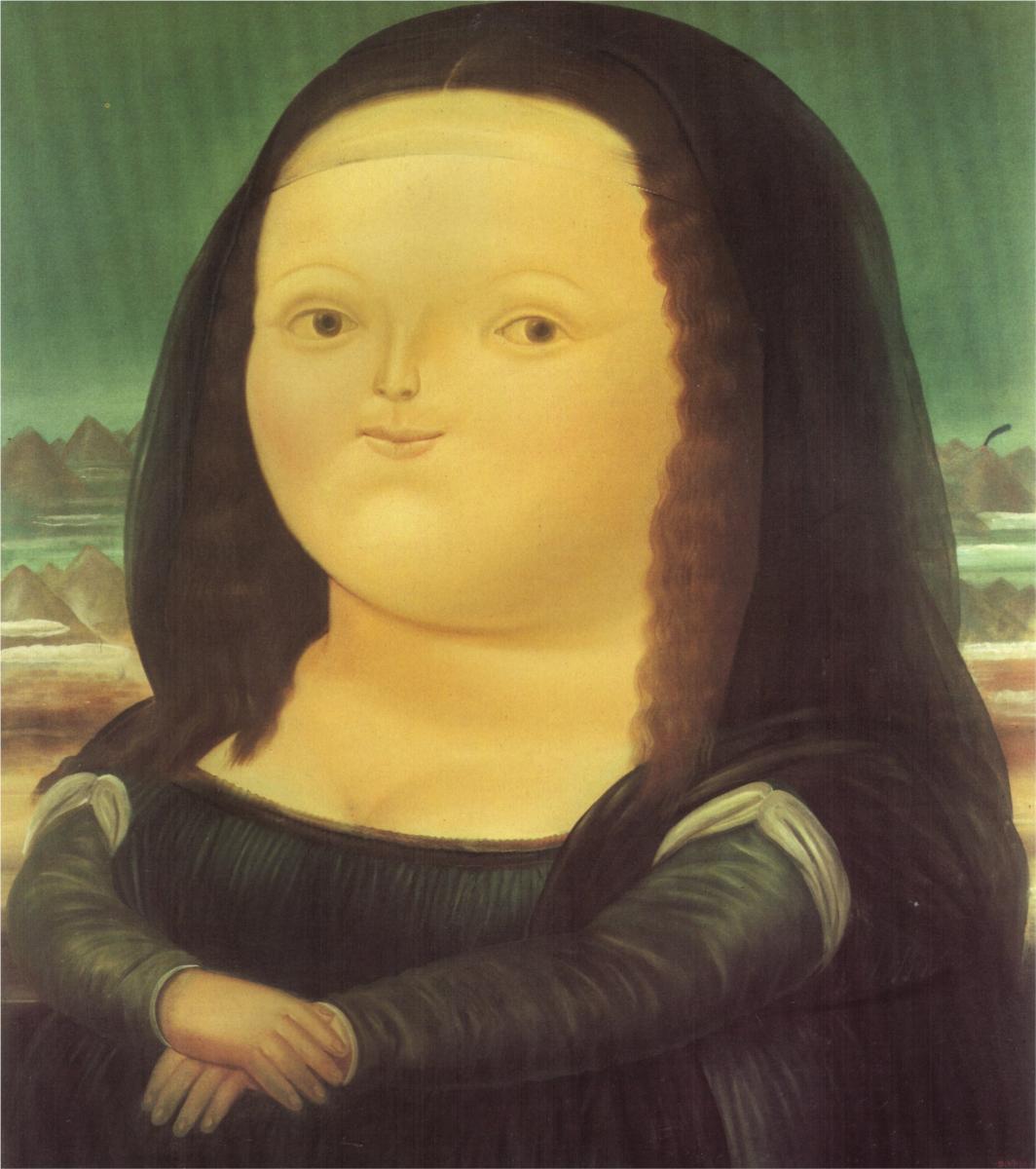
Thanks for the back-up Chriskooo. Most of these other commenters don’t understand the design process. Ives’ goal is not to reinvent the past but set the tone for future design from Apple. iOS7 was more about abandoning drop shadows and glares and RGB colors than it was about perfecting the calendar icon, etc.
I think Jony did a great job and I still prefer most of the original icons. Especially the Settings Icon looks much better than the alternative.