An iOS 7 redesign posted on Dribbble.com, and online community for designers, was “created by 20-year old UI/UX designer Leo Drapeau [and] has, as of today, reached over 97,000 views,” Sarah Perez reports for TechCrunch.
“Drapeau, who’s currently living in Paris and is pursuing his Bachelor’s in Web Design at a school called EEMI, says he made his version of the redesign in a few hours,” Perez reports. “‘I was following the WWDC keynote, and I was really excited about the overall UX and UI changes and evolutions in iOS 7, but the icons of the homescreen bugged me,’ he explains. ‘So, I just wanted to refined them a little, to make them cleaner and more harmonized, but not to reinvent the whole design.'”
Perez reports, “The student designer’s work has clearly struck a chord. The set of iOS 7 images now has ten pages and hundreds of comments, most of them positive and some offering tips as to how the design could be improved a bit further with minor tweaks.”
MacDailyNews Take: Yeah, um, Jony et al., you lose (on consistent light source, certain sizing, and the settings icon, among others). If you haven’t already, send Leo an offer letter now.
Of course, once you organize your stuff into folders and change your wallpaper, iOS 7 looks markedly different than what you see on Apple’s site. Something more like this: Apple’s basic iOS 7 example (left) vs. a MacDailyNews iPhone 5 running iOS 7 with apps in folders (right).
What ever happened to Apple leading in iconography… the eighties… the look of simplicity… the artistry… the calligraphy… the 100,000s+++ of dollars spent on logo design… where is all that?
Where is THAT Apple? Rushing a bunch of ham fisted logos out to market? If you didn’t get it right before— then say so and GET IT RIGHT NOW!
I like Johnny’s better, except the one with the check box, he did win that one. The others he mostly just made the center art smaller. I think they need to be large.
Nah I don’t agree.
They look a little but sharper because they are smaller and some areas and stuff but that’s a taste thing I think. After looking for a few minutes I can’t say I think his is better. Maybe 2-3 if the icons looks sharper but change one and you probably have to change everyone.
I own an apple product and I don’t care about the icons, I think people should complain that they new icons don’t аdd ANY functionality to them so who cares what they LOOK like, give me widgets!
Actually, with iOS’s design, I find that I have to think and get to the app. With Leo’s design, I do not have to think before I know which app is which. And for the case of icon and UI design, no thinking needed is better than logical thinking needed. Also, the App Store icon from Leo clearly shows what it means by “Less is More”.
To me iOS7 is a total FAIL. The graphics are an abomination and any good graphics design school would give you a big F. I found the cheap tacky graphics so disgusting that I reloaded iOS6. Of course I could not restore any of my apps or contacts, but I would rather go through the trouble to get good looking graphics. Sure iOS7 has some new features, but there is not enough of a difference for me to put up with 1980s IBM-PC CGA graphics on my high resolution retina display. Does anybody really like the flat boring washed out graphics? Why would anybody like flat cheap look compared to iOS6. I hope this flat low tech style of graphics is not the “in” thing. It is a step back in time to when having a 16 color monitor was a bit deal.
Thanks for the back-up Chriskooo. Most of these other commenters don’t understand the design process. Ives’ goal is not to reinvent the past but set the tone for future design from Apple. iOS7 was more about abandoning drop shadows and glares and RGB colors than it was about perfecting the calendar icon, etc.


Has Samsung offered this kid a job yet? 😉
I evaluated the two versions of icons before scrolling down to see which one was by whom. My preference in that blind-test was for Ive’s.
HEY!
What ever happened to Apple leading in iconography… the eighties… the look of simplicity… the artistry… the calligraphy… the 100,000s+++ of dollars spent on logo design… where is all that?
Where is THAT Apple? Rushing a bunch of ham fisted logos out to market? If you didn’t get it right before— then say so and GET IT RIGHT NOW!
I like Johnny’s better, except the one with the check box, he did win that one. The others he mostly just made the center art smaller. I think they need to be large.
I am supporting Johnny I’ve design. The one designed by drapeau does not have a grand feeling. Johnny Ive colors looks lively compare to drapeau.
As for icon, I also agree to Johnny Ive on the design of the icon. Looks more stunning in this way. Good try drapeau.
Nah I don’t agree.
They look a little but sharper because they are smaller and some areas and stuff but that’s a taste thing I think. After looking for a few minutes I can’t say I think his is better. Maybe 2-3 if the icons looks sharper but change one and you probably have to change everyone.
Not really that different IMO, but Ive’s design is a bit better for people without great eyesight.
Look at the Clock, the Phone and the Music Note – shrinking them does nothing except making it more difficult for some people to see.
And, yes, I wear bifocals. 🙁
I own an apple product and I don’t care about the icons, I think people should complain that they new icons don’t аdd ANY functionality to them so who cares what they LOOK like, give me widgets!
Actually, with iOS’s design, I find that I have to think and get to the app. With Leo’s design, I do not have to think before I know which app is which. And for the case of icon and UI design, no thinking needed is better than logical thinking needed. Also, the App Store icon from Leo clearly shows what it means by “Less is More”.
To me iOS7 is a total FAIL. The graphics are an abomination and any good graphics design school would give you a big F. I found the cheap tacky graphics so disgusting that I reloaded iOS6. Of course I could not restore any of my apps or contacts, but I would rather go through the trouble to get good looking graphics. Sure iOS7 has some new features, but there is not enough of a difference for me to put up with 1980s IBM-PC CGA graphics on my high resolution retina display. Does anybody really like the flat boring washed out graphics? Why would anybody like flat cheap look compared to iOS6. I hope this flat low tech style of graphics is not the “in” thing. It is a step back in time to when having a 16 color monitor was a bit deal.
Coming along and copying Ives’ work while making “tweaks” is the equivalent of me repainting DaVinci’s Mona Lisa, except with a full smile.
Completely agree. Do you mean, something like this?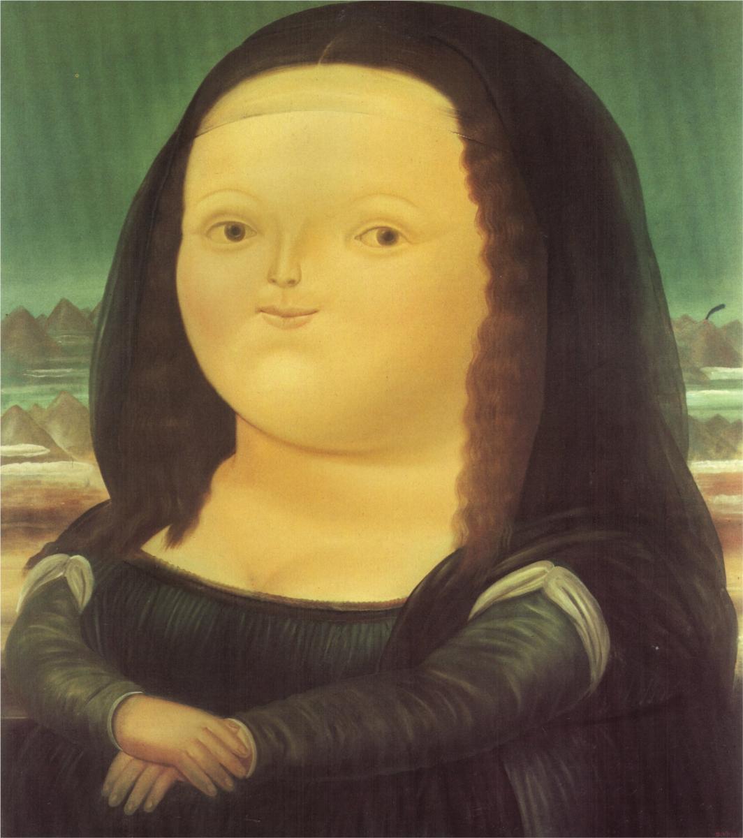
Thanks for the back-up Chriskooo. Most of these other commenters don’t understand the design process. Ives’ goal is not to reinvent the past but set the tone for future design from Apple. iOS7 was more about abandoning drop shadows and glares and RGB colors than it was about perfecting the calendar icon, etc.
I think Jony did a great job and I still prefer most of the original icons. Especially the Settings Icon looks much better than the alternative.